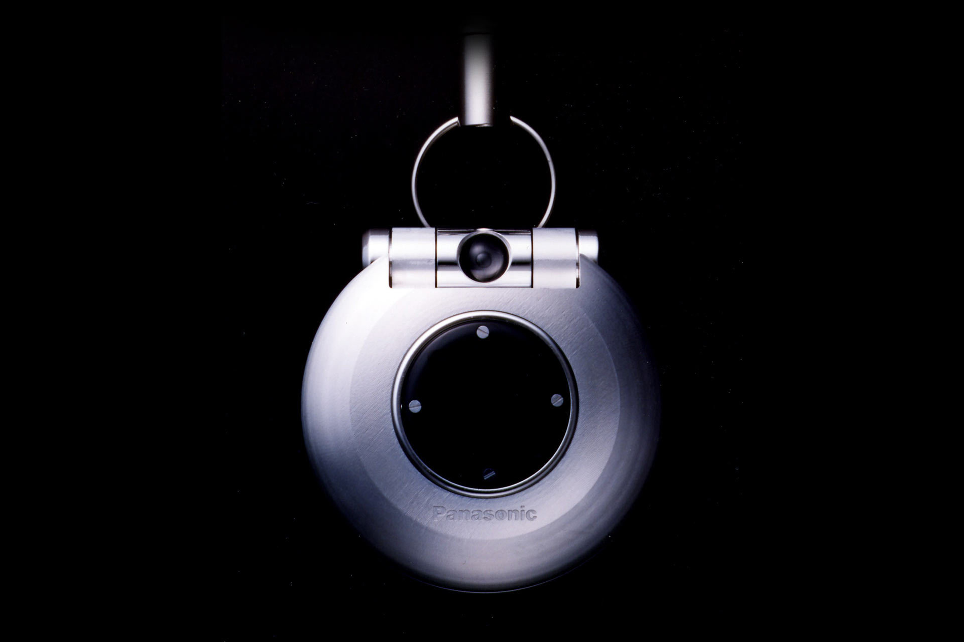
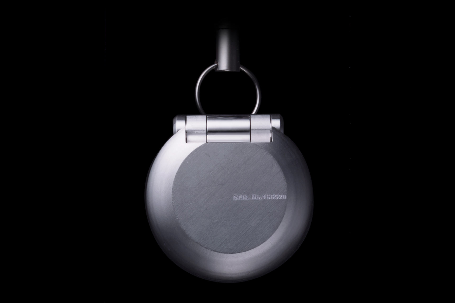
mobile phone for Panasonic (2003)
Panasonic has decided to entrust us with the project of a new top-level mobile phone. At first, we tried to think when, nowadays, an object can be considered a valuable one. With the coming of industrial design the value of a product has become its reproducibility in thousands of pieces with the same quality features. However nowadays things have changed. For instance, let’s consider that if you own a very expensive object, and that is mass-produced, it doesn’t matter how expensive it is, it’s clear that someone owns the exact copy of yours. Conversely, if you think about a handcrafted bowl of an artist, it is surely imperfect than the one created in a factory, and it’s for this reason that it becomes more precious. In short, the most exclusive products are the handcrafted ones, because they are imperfect and one-offs. We wanted to apply this concept to the project of a mass-product, creating imperfections on it surfaces that could make it valuable and unique. In order to get what we wanted, we let the screws visible on purpose, so as to stress the attention on the assembly of the parts and, furthermore, we have exploited a chemical corrosion process on the perfect mobile surfaces, that gave each piece a different look. Basically, the same thing that occurs to vintage jeans made particular and unique by the wear and tear of time. Through this project we wanted to express the value of the unique piece today, beautiful because imperfect, applying this concept to the production of a mass-product.

USB Flash drive for SOLID ALLIANCE (2006)
Can one leave important memory in a USB Flash Drive for a long time?
USB Flash Drive is generally used to transfer either files or pictures to somebody else. It’s normally used as a temporary device since its contents are soon deleted. Its success is due to the fact that it is cheap, thin, small, light-weight and easy to use. But, at the same time, this is also the reason why it is used with little attention. We think that perhaps what happens since the pictures or the data is stored is not so important. But there are also the important recollections, the unforgettable ones, those that you will remember your whole life, such as the wedding or the birth of our children. Would you really want to delete such unforgettable memories? Would you rather keep them in a cheap plastic USB Flash Drive or in a CD or DVD which can be afforded by everybody? Negligible and unforgettable memories are not the same thing. Our project began with this in mind. As we wanted our USB Flash Drive to be used with care and attention, we chose a precious, expensive, bulky and heavy material, that would be difficult to use. Our USB Flash Drive I similar to a puzzle where the memory is housed in the inner part of the body. Without disassembling the puzzle, you will never be able to access the memory that is stored inside. And once you store your unforgettable memory there, you must assemble the cube. This is exactly the opposite way that a common USB Flash Drive is used. Something very precious shouldn’t be easy, in the same way an opera of art isn’t. We wanted to highlight the significance of precious memories with this intricate and time-consuming movement. We didn’t design the shape of an object rather we wanted to outline an action.


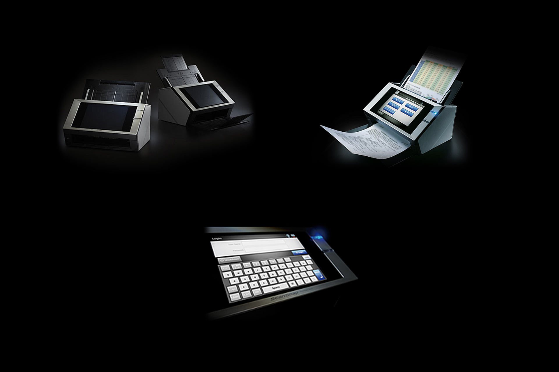
scanner for FUJITSU / PFU (2008)
Icon
Our client entrusted us the task of designing the “ScanSnap” series flagship model, addressed to the business field, and expressly to those users that, needing to scan many documents at once, require an ADF (Auto Document Feeder) scanner. The first thing to notice in comparing an ADF scanner and an ordinary inkjet printer is that the two items, despite their different functions, aesthetically resemble each other. Conversely, we thought our object should have been different, so we decided to design it in order to be immediately distinguishable to users and not to be confused with a printer. Considering the functional perspective, the main difference between an ADF scanner and a printer, although they both have a sheet infeed and outfeed, is that in the former the core is the infeed (to receive the documents), while in the latter it is the outfeed (to release the printed sheets). With this concept in mind, we defined a brand new “iconic” style for the scanner, considering the two above-mentioned parts, bigger or smaller, according to their importance (more important means bigger, and viceversa): since in a scanner the infeed should be bigger than the outfeed, we gave it a funnel shape, contrariwise to what we would have done for a printer. As a consequence, we have enlarged the documents infeed as it coud ideally “swallow” a whole bundle of papers. In order to emphasize even more this aspect, the infeed is black and polished, in sharp contrast to the rest of the white, mat body. All of this made our scanner definitely different from any other ordinary inkjet printer. design by Toshiki Satoji with Alvise Gangarossa

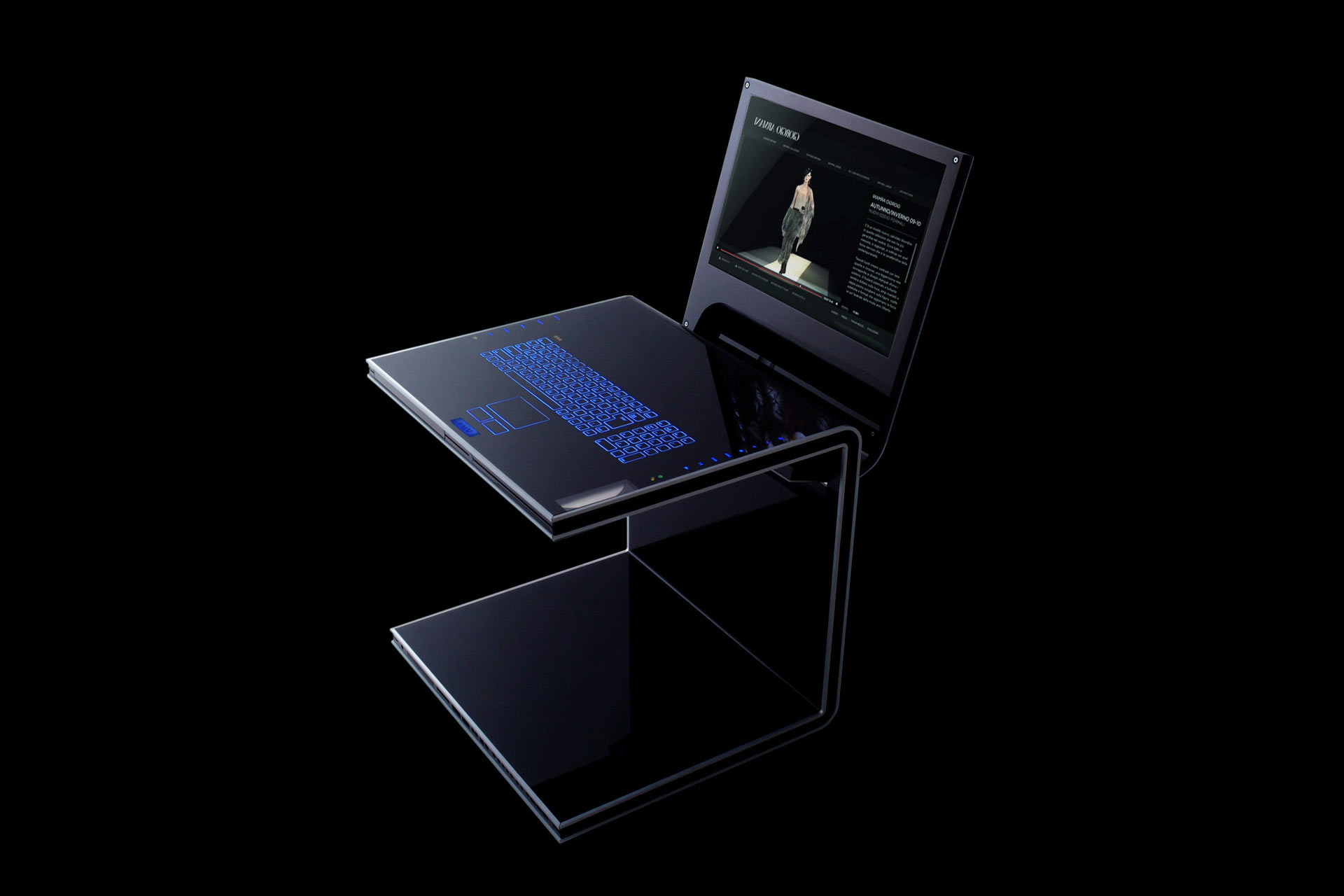
computer for FUJITSU (2005)
Mimesis
Those who use computers all day long at work, would avoid with pleasure seeing it also when they come back home. Nowadays, we can do everything with PCs, therefore it has become an indispensable tool even at home: we use it to listen to music, to watch movies/television/Youtube, to communicate through mail/Skype/social networks, to surf on the net and to make shopping. For this reason we have decided to create a PC with a fresh style, that breaks up with the traditional idea of a computer, integrating in the home background and keeping a certain harmony with the style of trendy furniture. In the forest, some insects can’t be seen by predators because they employ techniques of camouflage that allow them to take the features of a leave, a branch, etc. Our PC employs the same principle: when it is closed, it doesn’t look like a computer but like a short table, changing its appearance from a technologic object to a top-level piece of furniture. designed by Toshiki Satoji with Katsuya Masaki


wifi mobile scanner for FUJITSU / PFU (2013)
Everywhere
The ultra-portable solution with “built-in Wi-Fi connectivity and Battery” makes scanning on the go more efficient and productive than ever before. It has been designed to support the needs of business professionals – wherever they are or whatever document they need to get scanned. The latest member of the ScanSnap family allows mobile workers to capture documents directly to “Smartphones”, “Tablets”, “PCs and Macs” via Wi-Fi and to share the data via “Cloud Services”. It is the fastest in its class to date. The ScanSnap iX100 takes the business professional to new levels of productivity and efficiency, wherever he or she is doing business. design by Toshiki Satoji with Takashi Kirimoto


wifi scanner for FUJITSU / PFU (2011)
Analogue and digital (mechanical and electronic)
ScanSnap iX500 represents a Full Model Change compared to the former ScanSnap S1500. Documents scanned by iX500 may be viewed or read by smart-phones and tablets thanks to the Wi-Fi (wireless) technology built into the scanner. The Wi-Fi is a great value added to the iX500 and since it is the first scanner in the world to use this technology, we thought thoroughly how to express the Wi-Fi presence on the object design. In order to understand this, just consider a movie example: in “Terminator I” a huge and muscular enemy (Schwarzenegger) threatens the safety of the protagonists. Conversely, in “Terminator II”, the huge and muscular enemy of the first movie becomes a friend of the protagonist, and it’s going to face a new threat (the new Terminator). The latter is thin and it looks weak, but despite the appearance, it’s much stronger and it shows better performances than the old muscular Terminator. They both face each other fighting: one makes use of its mechanical and muscular force (like a bulldozer), while the other, employs the refinement of an advanced technology (digital). This story serves as an inspiration for the new scanner design. While the old S1500 has a mechanical style, we gave the new iX500 interface a digital look in order to show the overwhelming improvement of its performances. Its black colour is the result of our research both in the office and home environment (where the iX500 will be used), that shows how the colour trend of such products has changed compared to four years ago (when the previous model S1500 was launched). As a matter of fact, nowadays darker colours prevail, therefore we chose black colour to integrate (camouflage) the iX500 into the environment, similarly to what we did with the previous S1500 concept. design by Toshiki Satoji with Alvise Gangarossa

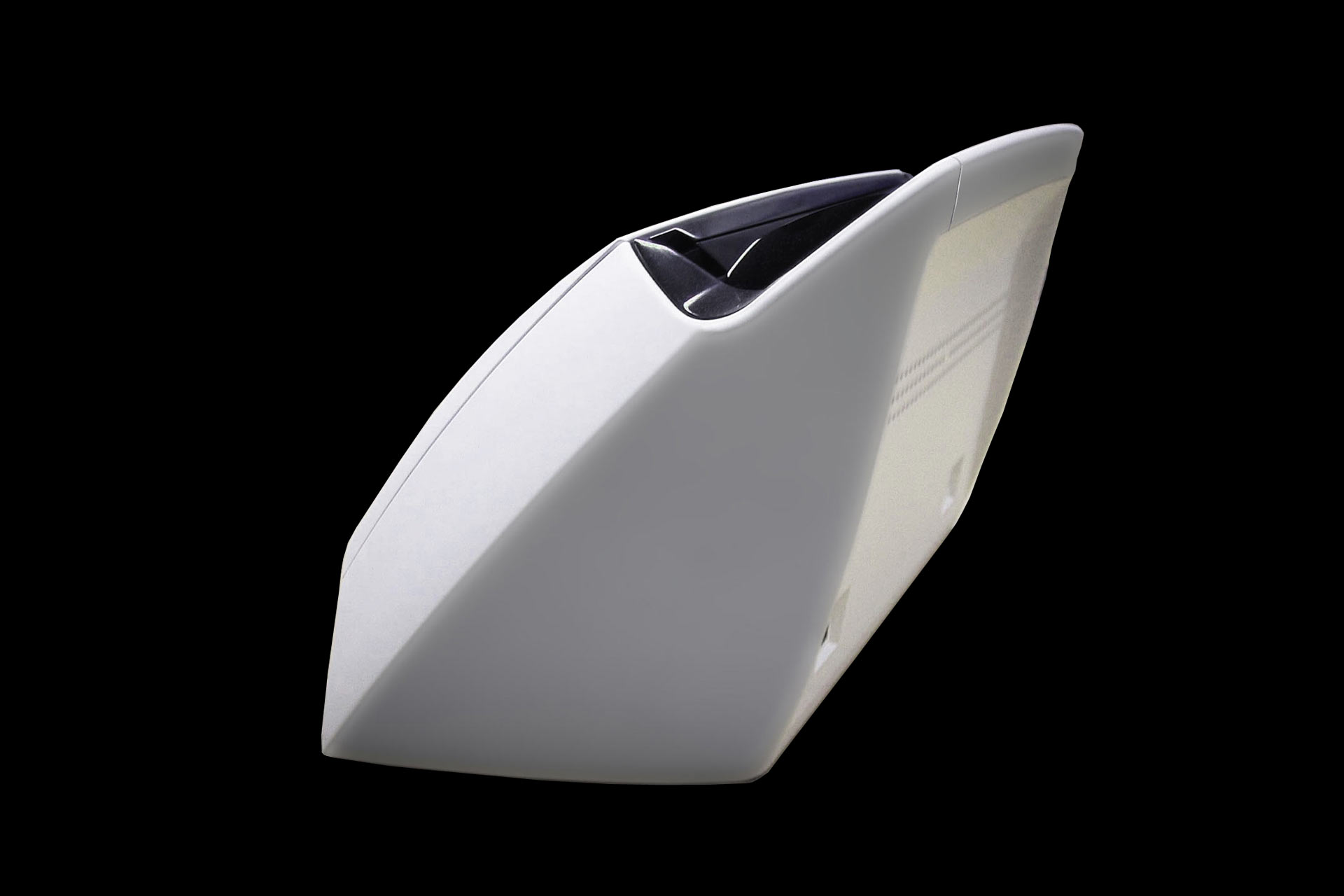
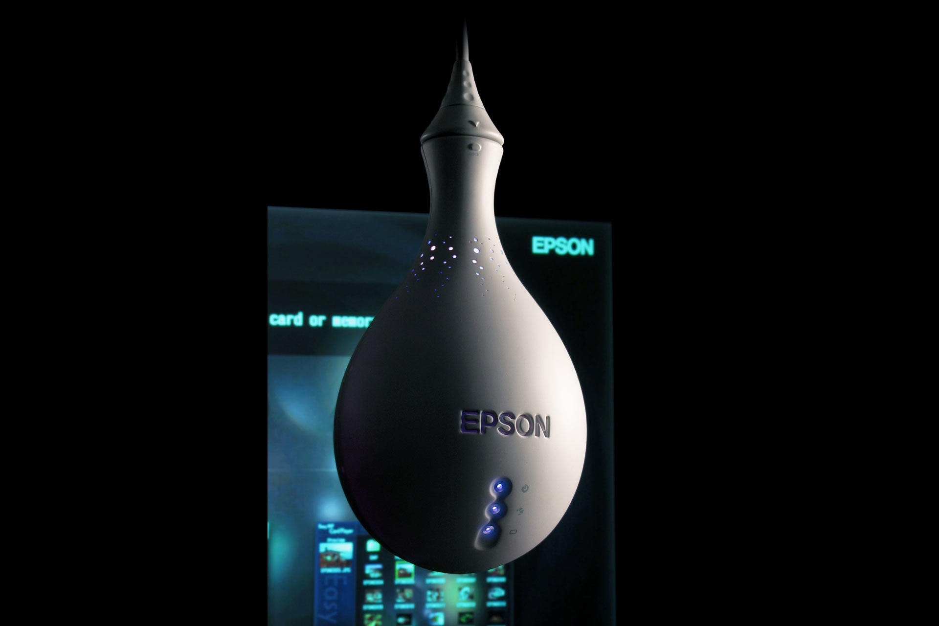
soho projector for EPSON (2004)
Use instruction
The goal of this project consists in creating a projector with speakers and DVD included for the SOHO (Small Office, Home Office) target, that is to say for small companies and for the home field of the Japanese market. During our research, we have attended many business presentations an also several examples of use as home cinema. We have noticed that during company presentations the speaker handles the slides by the pc, taking place by the side of the projector, while the audience is placed facing the back of it. For what concerns the home use, you generally sit on the sofa placing the projector in front of you, as it happens for the “company audience”. These are the two main ways of use reflected by the projector’s design. Dividing the object into two areas with a 45° cut on the top side, we get one part meant for the company use with connections and an interface to adjust the projection, and another part meant for the home use, in which the interface of video reproduction and the sound equipment to watch movies are included. In order to transmit visually the high quality of the speakers employed, we have designed the volume control drawing inspiration from the analogic professional stereo.
network scanner for FUJITSU / PFU (2009)
Frame
N1800 is a “network scanner “designed specifically for business use. Via LAN connection, you can connect it to many computers in order to create an operating network. Although usually scanners need to be connected to a PC to receive instructions, N1800 is independent since it already integrates a computer: this allows to manage its functions through the touchscreen placed on the body of the scanner. With a simple touch on the screen, you can save and share the scanned data with connected PCs, but you can also send them to printers or via e-mail as attachments. The touchscreen is the key element that makes N1800 different from any other scanner, therefore we decided to highlight this peculiarity by applying a frame all around it, in order to stress its presence. design by Toshiki Satoji with Luigi Zanca

video projector for EPSON (2003)
Creating a new market
We carried out a research that finally showed how projectors employed as home cinema or employed to watch TV are unlikely to have a competitive market because of the success of flat televisions. Since it was impossible for us to get into the existing home entertainment market, we have decided to create a new one specially for our client, starting from the search of a new way of using projectors at home. In the western world, people usually invite a lot of friends at home to have parties, dinners and to watch all together the holidays’ pictures or to enjoy the match of their favourite team. Obviously, in these cases, if we used a traditional device laid on a table or on the floor, the showing would be disturbed by the unceasing bustle of people. Moreover, a projector meant to be used during parties would be too boring if it had a traditional appearance. These remarks brought about “Fantasma” (“ghost” in Italian), a projector designed to be hanged and screwed in the ceiling lamp connection instead of the light bulb, that projects from top to bottom and looks like a funny ghost. design by Toshiki Satoji with Sandie Cheng


Catania's underground for FIREMA (1999)
Breaking monotony
Designing Catania’s underground interiors, we have noticed that both maximum height and maximum width of the wagon remain unchanged. Simplifying ideally this concept the train is like an extrusion. In fact, if we cut a carriage at any point of its length, we can see that, despite its complicated shape, the section always remain the same. As a consequence the outline of the underground elements creates a pattern of parallel lines that appears boring to the passenger’s point of view. For this reason we have designed interiors that can break that monotony. Seats, in particular, reflect our concept since, visually, they are the most important object from a passenger’s perspective. However, the strict safety rules prevented us from changing the features of doors and windows. Giving to the back of seats a wavy dynamic outline, we get different heights at each section, breaking the repetitive pattern of parallel lines. Furthermore, their chromatic shade, from sky-blue to dark-blue, recalls the Mediterranean Sea that is also the scenario of the route of this underground. design by Toshiki Satoji with Peter Solomon

instant movie player for EPSON (2005)
Chopstick or cutlery?
Let’s imagine a Japanese dinner: participants use just a couple of “hashi” (chopsticks) to do a lot of actions: among other things they can take, tear and pierce food. In the western world, conversely, people use different kinds of cutlery (knives, forks, etc.) each with its specific function. If we bring this concept while comparing the Japanese and the European/American market, we can infer that a product meant for one can not have the same features of a product meant for the other. The goal of the project is to adapt an “all in one projector” (with speakers and DVD included) available in the home theatre field for basic users of the Japanese market, to the European/American market. For what concerns the first version, designers chose just one colour, white, very esteemed in the Japanese culture. The speakers sides, the DVD and the whole body were white too, in order to make the device look like a compact piece: there wass no clear distinction among its functions, and these could be hardly recognized at first sight. This is the reason why the product didn’t suit the European/American market. Considering the previous remarks, the second version of the projector has been designed highlighting the functions of the different parts as it happens with the western cutlery. In order to do this we chose to conceive the projector with just one function for each side, exploiting the shape of the cube, whose parts are emphasised by a high chromatic contrast (black-white) that allows to distinguish them clearly.
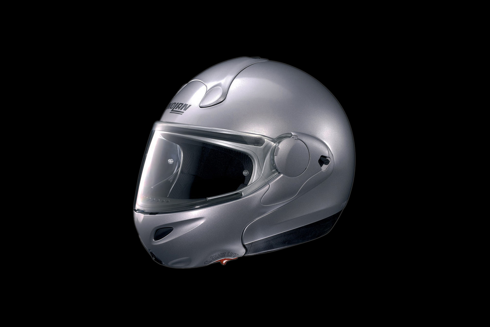

helmet for NOLAN (1996)
Chains and freedom
Motorbikes become stronger and stronger, getting more efficient performances. But this also implies higher safety needs. Unfortunately, the safety equipments also become more uncomfortable and heavy, leaving a feeling of tightness. Where is freedom? Where is the sensation of wind through the hair, so much beloved by bikers? The origin of this project lays in creating a crash helmet that combines high safety standards and a unique feeling of freedom. design by Toshiki Satoji with Luca Gafolio


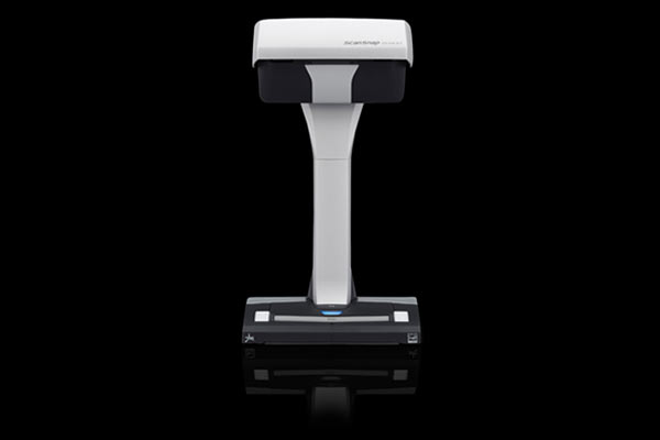
scanner for FUJITSU / PFU (2008)
W-face
Looking at the previous model, we have realized that, working on the project, the company has focused on conceiving the image of the object when it’s not operating, that is to say with trays closed. However, considering that this product is designed for the business field, since the beginning we had some doubts about this setting. Our project, therefore, goes towards the opposite way: focusing on the design of the object when it’s operating (trays open). Only in this case users relate to it through use, and while they are waiting for the scanning to be done, they can enjoy the inner part and the interface. Conversely, when it’s not operating (trays closed), it loses its importance and, mixing up with other office tools, it practically disappears. When it operates, the inner parts emphasise its technologic features, accuracy and performance. As Clark Kent and Superman represent two faces of the same personality, we wanted to give two faces to the same object. design by Toshiki Satoji with Luigi Zanca

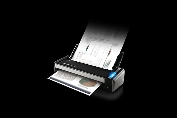
mobile scanner for FUJITSU / PFU (2009)
Everywhere
S1100 is a mobile scanner designed for those people whose workplace is not an office, as couriers, insurers and salesmen. Thanks to the Cloud service, it allows you to save the scanned data on the Internet, from anywhere and from any PC connected to the Net. With S1100 a salesman, for instance, can scan the business cards of the customers he meets outside the office; likewise, he can capture his competitors’ new products catalogues without needing to carry around the burden of a laptop and the bunch of papers otherwise collected while visiting fairs. Moreover, he may scan new contracts drawn up all around the world and send them far away, real-time to the company’s headquarter. design by Toshiki Satoji with Alvise Gangarossa

ADF scanner for FUJITSU / PFU (2008)
Brand
S1300 is the “ScanSnap” series basic model and the S1500 ADF scanner “younger brother”. In projecting this item, our goal was to create a specific “brand” that could identify the “ScanSnap” series: as a consequence we followed the same design concept employed in S1500 scanner. Designing several scanner models means to us a real contribute in digitising paper documents, so as to reduce the use of paper and to safeguard forests. design by Toshiki Satoji with Luigi Zanca

new type scanner for FUJITSU / PFU (2010)
only one
ScanSnap SV600 is the first scanner that capable of contact-less scanning. Users simply place items on a desk to capture them. The scanner can digitise a great variety of objects: bound or stapled documents up to A3 size, such as notebooks, newspapers, catalogues, business cards, fragile originals, and objects up to 3 cm thick.This scanner even produces high-quality images of curved objects. One-button operation and the digital document is ready for use on a PC, in a cloud service, or via a smartphone or tablet, in just seconds. design by Toshiki Satoji with Alvise Gangarossa
mobile phone for Panasonic (2003)
Beauty in imperfection…the one off
Panasonic has decided to entrust us with the project of a new top-level mobile phone. At first, we tried to think when, nowadays, an object can be considered a valuable one. With the coming of industrial design the value of a product has become its reproducibility in thousands of pieces with the same quality features. However nowadays things have changed. For instance, let’s consider that if you own a very expensive object, and that is mass-produced, it doesn’t matter how expensive it is, it’s clear that someone owns the exact copy of yours. Conversely, if you think about a handcrafted bowl of an artist, it is surely imperfect than the one created in a factory, and it’s for this reason that it becomes more precious. In short, the most exclusive products are the handcrafted ones, because they are imperfect and one-offs. We wanted to apply this concept to the project of a mass-product, creating imperfections on it surfaces that could make it valuable and unique. In order to get what we wanted, we let the screws visible on purpose, so as to stress the attention on the assembly of the parts and, furthermore, we have exploited a chemical corrosion process on the perfect mobile surfaces, that gave each piece a different look. Basically, the same thing that occurs to vintage jeans made particular and unique by the wear and tear of time. Through this project we wanted to express the value of the unique piece today, beautiful because imperfect, applying this concept to the production of a mass-product.
video projector for EPSON (2003)
Creating a new market
We carried out a research that finally showed how projectors employed as home cinema or employed to watch TV are unlikely to have a competitive market because of the success of flat televisions. Since it was impossible for us to get into the existing home entertainment market, we have decided to create a new one specially for our client, starting from the search of a new way of using projectors at home. In the western world, people usually invite a lot of friends at home to have parties, dinners and to watch all together the holidays’ pictures or to enjoy the match of their favourite team. Obviously, in these cases, if we used a traditional device laid on a table or on the floor, the showing would be disturbed by the unceasing bustle of people. Moreover, a projector meant to be used during parties would be too boring if it had a traditional appearance. These remarks brought about “Fantasma” (“ghost” in Italian), a projector designed to be hanged and screwed in the ceiling lamp connection instead of the light bulb, that projects from top to bottom and looks like a funny ghost. design by Toshiki Satoji with Sandie Cheng
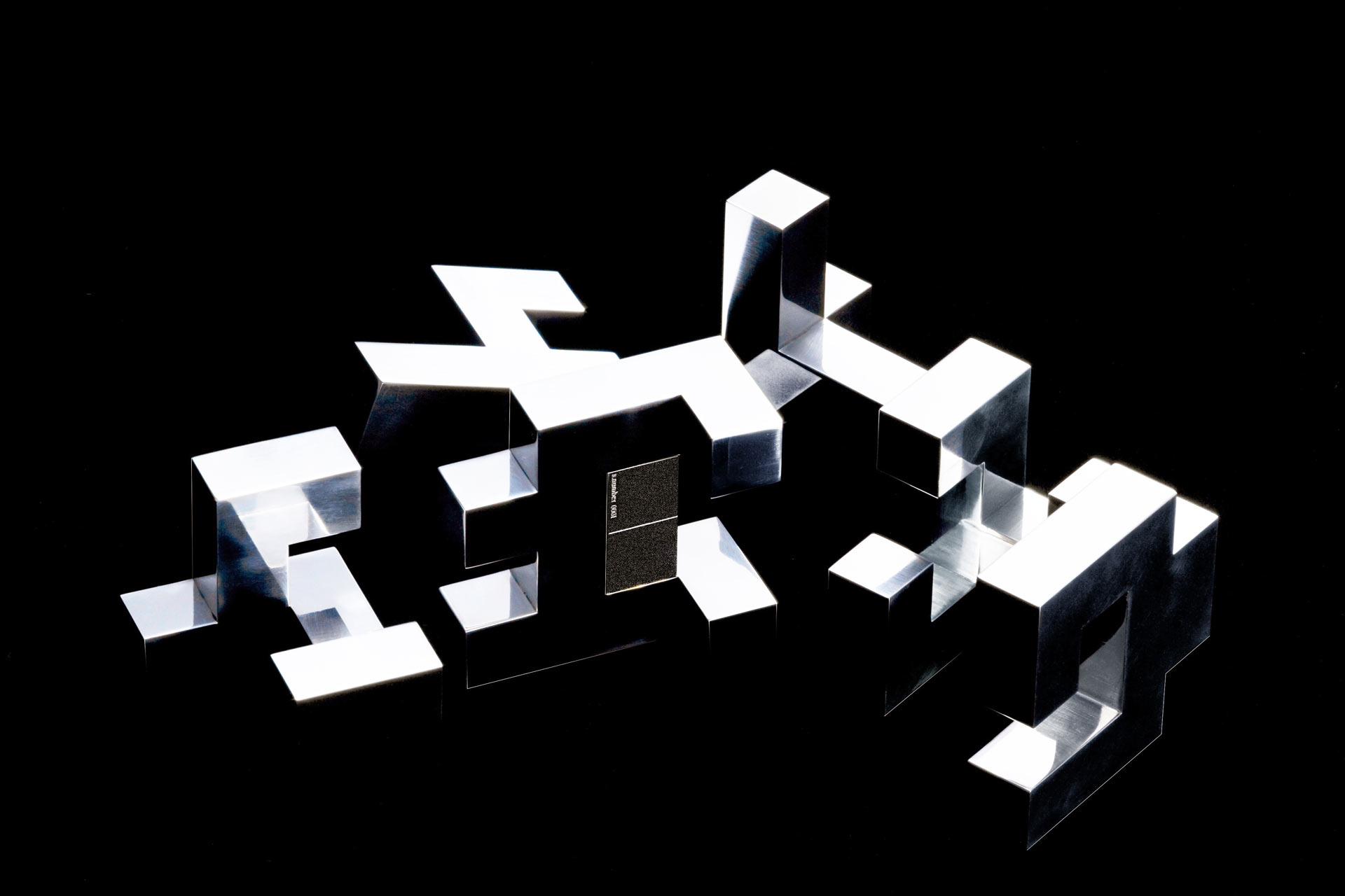
USB Flash drive for SOLID ALLIANCE (2006)
The value of useless things
Can one leave important memory in a USB Flash Drive for a long time?
USB Flash Drive is generally used to transfer either files or pictures to somebody else. It’s normally used as a temporary device since its contents are soon deleted. Its success is due to the fact that it is cheap, thin, small, light-weight and easy to use. But, at the same time, this is also the reason why it is used with little attention. We think that perhaps what happens since the pictures or the data is stored is not so important. But there are also the important recollections, the unforgettable ones, those that you will remember your whole life, such as the wedding or the birth of our children. Would you really want to delete such unforgettable memories? Would you rather keep them in a cheap plastic USB Flash Drive or in a CD or DVD which can be afforded by everybody? Negligible and unforgettable memories are not the same thing. Our project began with this in mind. As we wanted our USB Flash Drive to be used with care and attention, we chose a precious, expensive, bulky and heavy material, that would be difficult to use. Our USB Flash Drive I similar to a puzzle where the memory is housed in the inner part of the body. Without disassembling the puzzle, you will never be able to access the memory that is stored inside. And once you store your unforgettable memory there, you must assemble the cube. This is exactly the opposite way that a common USB Flash Drive is used. Something very precious shouldn’t be easy, in the same way an opera of art isn’t. We wanted to highlight the significance of precious memories with this intricate and time-consuming movement. We didn’t design the shape of an object rather we wanted to outline an action.
Catania's underground for FIREMA (1999)
Breaking monotony
Designing Catania’s underground interiors, we have noticed that both maximum height and maximum width of the wagon remain unchanged. Simplifying ideally this concept the train is like an extrusion. In fact, if we cut a carriage at any point of its length, we can see that, despite its complicated shape, the section always remain the same. As a consequence the outline of the underground elements creates a pattern of parallel lines that appears boring to the passenger’s point of view. For this reason we have designed interiors that can break that monotony. Seats, in particular, reflect our concept since, visually, they are the most important object from a passenger’s perspective. However, the strict safety rules prevented us from changing the features of doors and windows. Giving to the back of seats a wavy dynamic outline, we get different heights at each section, breaking the repetitive pattern of parallel lines. Furthermore, their chromatic shade, from sky-blue to dark-blue, recalls the Mediterranean Sea that is also the scenario of the route of this underground. design by Toshiki Satoji with Peter Solomon
scanner for FUJITSU / PFU (2008)
Our client entrusted us the task of designing the “ScanSnap” series flagship model, addressed to the business field, and expressly to those users that, needing to scan many documents at once, require an ADF (Auto Document Feeder) scanner. The first thing to notice in comparing an ADF scanner and an ordinary inkjet printer is that the two items, despite their different functions, aesthetically resemble each other. Conversely, we thought our object should have been different, so we decided to design it in order to be immediately distinguishable to users and not to be confused with a printer. Considering the functional perspective, the main difference between an ADF scanner and a printer, although they both have a sheet infeed and outfeed, is that in the former the core is the infeed (to receive the documents), while in the latter it is the outfeed (to release the printed sheets). With this concept in mind, we defined a brand new “iconic” style for the scanner, considering the two above-mentioned parts, bigger or smaller, according to their importance (more important means bigger, and viceversa): since in a scanner the infeed should be bigger than the outfeed, we gave it a funnel shape, contrariwise to what we would have done for a printer. As a consequence, we have enlarged the documents infeed as it coud ideally “swallow” a whole bundle of papers. In order to emphasize even more this aspect, the infeed is black and polished, in sharp contrast to the rest of the white, mat body. All of this made our scanner definitely different from any other ordinary inkjet printer. design by Toshiki Satoji with Alvise Gangarossa
instant movie player for EPSON (2005)
Chopstick or cutlery?
Let’s imagine a Japanese dinner: participants use just a couple of “hashi” (chopsticks) to do a lot of actions: among other things they can take, tear and pierce food. In the western world, conversely, people use different kinds of cutlery (knives, forks, etc.) each with its specific function. If we bring this concept while comparing the Japanese and the European/American market, we can infer that a product meant for one can not have the same features of a product meant for the other. The goal of the project is to adapt an “all in one projector” (with speakers and DVD included) available in the home theatre field for basic users of the Japanese market, to the European/American market. For what concerns the first version, designers chose just one colour, white, very esteemed in the Japanese culture. The speakers sides, the DVD and the whole body were white too, in order to make the device look like a compact piece: there wass no clear distinction among its functions, and these could be hardly recognized at first sight. This is the reason why the product didn’t suit the European/American market. Considering the previous remarks, the second version of the projector has been designed highlighting the functions of the different parts as it happens with the western cutlery. In order to do this we chose to conceive the projector with just one function for each side, exploiting the shape of the cube, whose parts are emphasised by a high chromatic contrast (black-white) that allows to distinguish them clearly.
computer for FUJITSU (2005)
Those who use computers all day long at work, would avoid with pleasure seeing it also when they come back home. Nowadays, we can do everything with PCs, therefore it has become an indispensable tool even at home: we use it to listen to music, to watch movies/television/Youtube, to communicate through mail/Skype/social networks, to surf on the net and to make shopping. For this reason we have decided to create a PC with a fresh style, that breaks up with the traditional idea of a computer, integrating in the home background and keeping a certain harmony with the style of trendy furniture. In the forest, some insects can’t be seen by predators because they employ techniques of camouflage that allow them to take the features of a leave, a branch, etc. Our PC employs the same principle: when it is closed, it doesn’t look like a computer but like a short table, changing its appearance from a technologic object to a top-level piece of furniture. designed by Toshiki Satoji with Katsuya Masaki
helmet for NOLAN (1996)
Motorbikes become stronger and stronger, getting more efficient performances. But this also implies higher safety needs. Unfortunately, the safety equipments also become more uncomfortable and heavy, leaving a feeling of tightness. Where is freedom? Where is the sensation of wind through the hair, so much beloved by bikers? The origin of this project lays in creating a crash helmet that combines high safety standards and a unique feeling of freedom. design by Toshiki Satoji with Luca Gafolio
wifi mobile scanner for FUJITSU / PFU (2013)
Everywhere
The ultra-portable solution with “built-in Wi-Fi connectivity and Battery” makes scanning on the go more efficient and productive than ever before. It has been designed to support the needs of business professionals – wherever they are or whatever document they need to get scanned. The latest member of the ScanSnap family allows mobile workers to capture documents directly to “Smartphones”, “Tablets”, “PCs and Macs” via Wi-Fi and to share the data via “Cloud Services”. It is the fastest in its class to date. The ScanSnap iX100 takes the business professional to new levels of productivity and efficiency, wherever he or she is doing business. design by Toshiki Satoji with Takashi Kirimoto
scanner for FUJITSU / PFU (2008)
W-face
Looking at the previous model, we have realized that, working on the project, the company has focused on conceiving the image of the object when it’s not operating, that is to say with trays closed. However, considering that this product is designed for the business field, since the beginning we had some doubts about this setting. Our project, therefore, goes towards the opposite way: focusing on the design of the object when it’s operating (trays open). Only in this case users relate to it through use, and while they are waiting for the scanning to be done, they can enjoy the inner part and the interface. Conversely, when it’s not operating (trays closed), it loses its importance and, mixing up with other office tools, it practically disappears. When it operates, the inner parts emphasise its technologic features, accuracy and performance. As Clark Kent and Superman represent two faces of the same personality, we wanted to give two faces to the same object. design by Toshiki Satoji with Luigi Zanca
wifi scanner for FUJITSU / PFU (2011)
Analogue and digital (mechanical and electronic)
ScanSnap iX500 represents a Full Model Change compared to the former ScanSnap S1500. Documents scanned by iX500 may be viewed or read by smart-phones and tablets thanks to the Wi-Fi (wireless) technology built into the scanner. The Wi-Fi is a great value added to the iX500 and since it is the first scanner in the world to use this technology, we thought thoroughly how to express the Wi-Fi presence on the object design. In order to understand this, just consider a movie example: in “Terminator I” a huge and muscular enemy (Schwarzenegger) threatens the safety of the protagonists. Conversely, in “Terminator II”, the huge and muscular enemy of the first movie becomes a friend of the protagonist, and it’s going to face a new threat (the new Terminator). The latter is thin and it looks weak, but despite the appearance, it’s much stronger and it shows better performances than the old muscular Terminator. They both face each other fighting: one makes use of its mechanical and muscular force (like a bulldozer), while the other, employs the refinement of an advanced technology (digital). This story serves as an inspiration for the new scanner design. While the old S1500 has a mechanical style, we gave the new iX500 interface a digital look in order to show the overwhelming improvement of its performances. Its black colour is the result of our research both in the office and home environment (where the iX500 will be used), that shows how the colour trend of such products has changed compared to four years ago (when the previous model S1500 was launched). As a matter of fact, nowadays darker colours prevail, therefore we chose black colour to integrate (camouflage) the iX500 into the environment, similarly to what we did with the previous S1500 concept. design by Toshiki Satoji with Alvise Gangarossa
mobile scanner for FUJITSU / PFU (2009)
Everywhere
S1100 is a mobile scanner designed for those people whose workplace is not an office, as couriers, insurers and salesmen. Thanks to the Cloud service, it allows you to save the scanned data on the Internet, from anywhere and from any PC connected to the Net. With S1100 a salesman, for instance, can scan the business cards of the customers he meets outside the office; likewise, he can capture his competitors’ new products catalogues without needing to carry around the burden of a laptop and the bunch of papers otherwise collected while visiting fairs. Moreover, he may scan new contracts drawn up all around the world and send them far away, real-time to the company’s headquarter. design by Toshiki Satoji with Alvise Gangarossa
soho projector for EPSON (2004)
Use instruction
The goal of this project consists in creating a projector with speakers and DVD included for the SOHO (Small Office, Home Office) target, that is to say for small companies and for the home field of the Japanese market. During our research, we have attended many business presentations an also several examples of use as home cinema. We have noticed that during company presentations the speaker handles the slides by the pc, taking place by the side of the projector, while the audience is placed facing the back of it. For what concerns the home use, you generally sit on the sofa placing the projector in front of you, as it happens for the “company audience”. These are the two main ways of use reflected by the projector’s design. Dividing the object into two areas with a 45° cut on the top side, we get one part meant for the company use with connections and an interface to adjust the projection, and another part meant for the home use, in which the interface of video reproduction and the sound equipment to watch movies are included. In order to transmit visually the high quality of the speakers employed, we have designed the volume control drawing inspiration from the analogic professional stereo.
ADF scanner for FUJITSU / PFU (2008)
Brand
S1300 is the “ScanSnap” series basic model and the S1500 ADF scanner “younger brother”. In projecting this item, our goal was to create a specific “brand” that could identify the “ScanSnap” series: as a consequence we followed the same design concept employed in S1500 scanner. Designing several scanner models means to us a real contribute in digitising paper documents, so as to reduce the use of paper and to safeguard forests. design by Toshiki Satoji with Luigi Zanca
network scanner for FUJITSU / PFU (2009)
Frame
N1800 is a “network scanner “designed specifically for business use. Via LAN connection, you can connect it to many computers in order to create an operating network. Although usually scanners need to be connected to a PC to receive instructions, N1800 is independent since it already integrates a computer: this allows to manage its functions through the touchscreen placed on the body of the scanner. With a simple touch on the screen, you can save and share the scanned data with connected PCs, but you can also send them to printers or via e-mail as attachments. The touchscreen is the key element that makes N1800 different from any other scanner, therefore we decided to highlight this peculiarity by applying a frame all around it, in order to stress its presence. design by Toshiki Satoji with Luigi Zanca
new type scanner for FUJITSU / PFU (2010)
only one
ScanSnap SV600 is the first scanner that capable of contact-less scanning. Users simply place items on a desk to capture them. The scanner can digitise a great variety of objects: bound or stapled documents up to A3 size, such as notebooks, newspapers, catalogues, business cards, fragile originals, and objects up to 3 cm thick.This scanner even produces high-quality images of curved objects. One-button operation and the digital document is ready for use on a PC, in a cloud service, or via a smartphone or tablet, in just seconds. design by Toshiki Satoji with Alvise Gangarossa